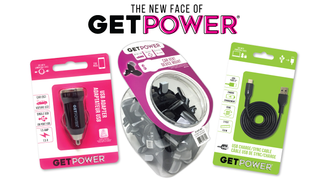
Starting this fall, Aries’ GetPower® line will be housed in some spiffy new packaging. We’re proud to say we’ve outgrown the grunge phase and are moving on to a cleaner look!
COLORS
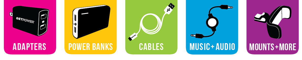
We’re steering away from color mixing and have instead assigned a single color to each category in our line. Now, instead of utilizing several colors on a single package, every item will be in white packaging paired with its coordinating accent color. With this new simplified color-coding, we are confident our packaging will look cleaner, brighter, and more streamlined in your store.
ICONS
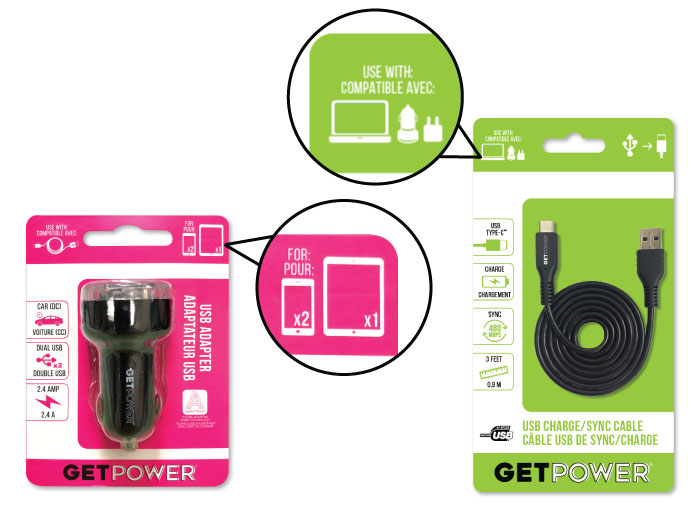
We’ve striped down the text and added simple visual elements to quickly present the facts. Now, everything you wanted to know about a product is clearly displayed on the front— with a picture!
![]()
We’ve also included helpful icons that indicate what the product can be used with, or other accessories you may need to go with it.
LOGO
A logo is the face of a company, and ours was really showing its age. No more crumbling fonts and stacked colors! The new GetPower® logo is straight, bold, and to the point.
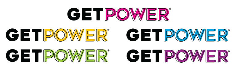
The updated logo can be used in any of the 5 category colors, with white or black accents (depending on placement).
Some new packaging is already in our warehouse and will continue to roll in as we order more product. If you have questions or comments about our updates, feel free to send us an email — we love hearing from you!
Comments are closed.